When someone doesn’t feel well and has symptoms, he often goes to forums to check what he has. The problem is that these kind of websites are rarely efficient and a safe bet.
You have a headache and comments on the forum tell you that you have brain cancer.
During 2019, we were in touch with Google and they wanted to develop an application to give a basic diagnosis to avoid what I talked above. We agreed to create a prototype after listing the features we wanted to implement.
The first step was to realise a benchmark of the companies which provide these types of services. We found 2 symptom checkers on the market but they were pretty basics with no interaction (simple forms). Moreover, we were in healthcare, so we had access to patients and doctors in order to define a very accurate prototype with the right features.
After running user interviews, we listed the painful points: forms are long, boring and there is no interaction. Therefore, we decided what was our main goal: add interaction and “gamification” to the app in order to reduce the feeling of boredom. With the team, we worked on each screen to find the right way to answer the questions and fulfil the form.
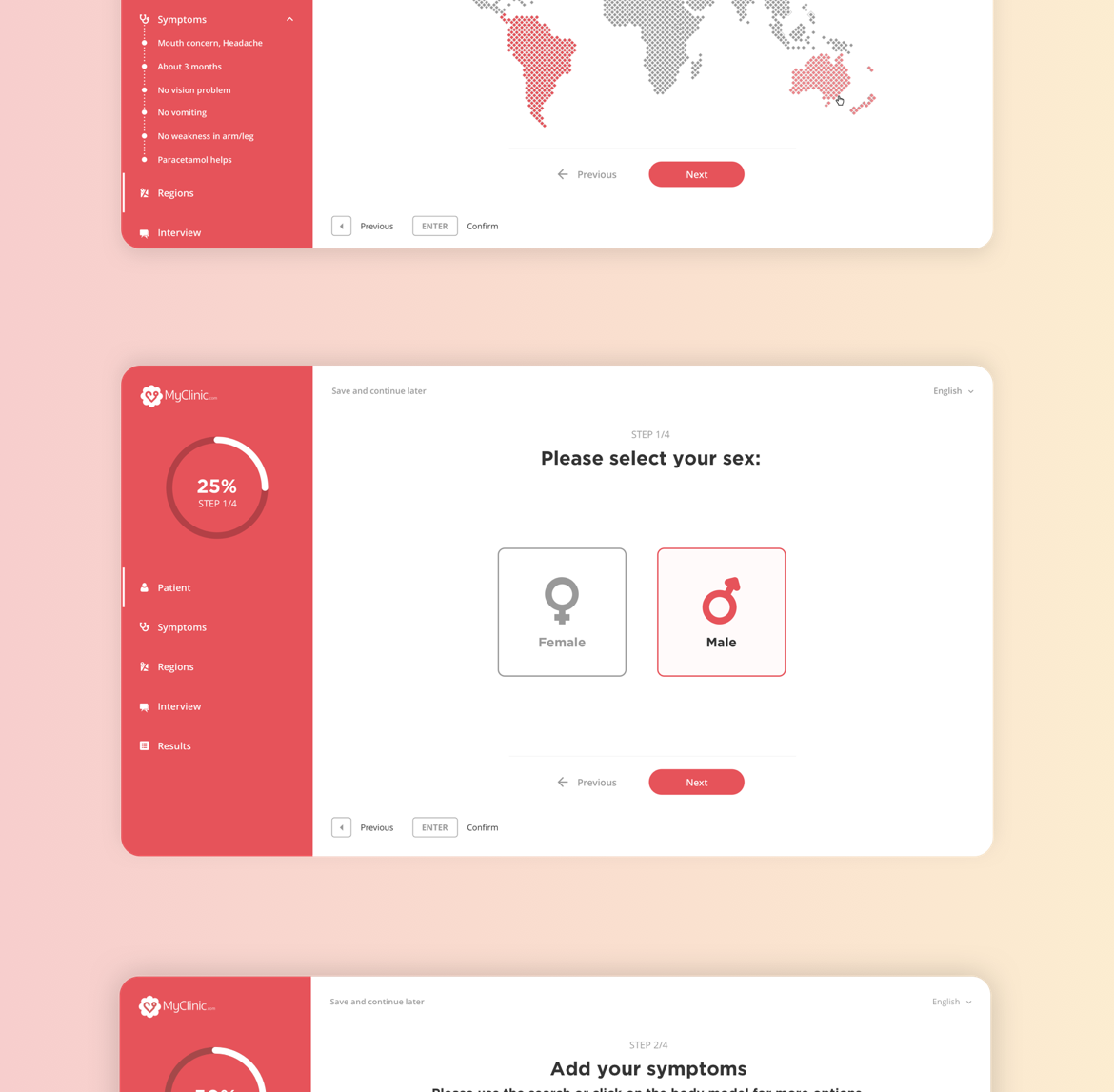
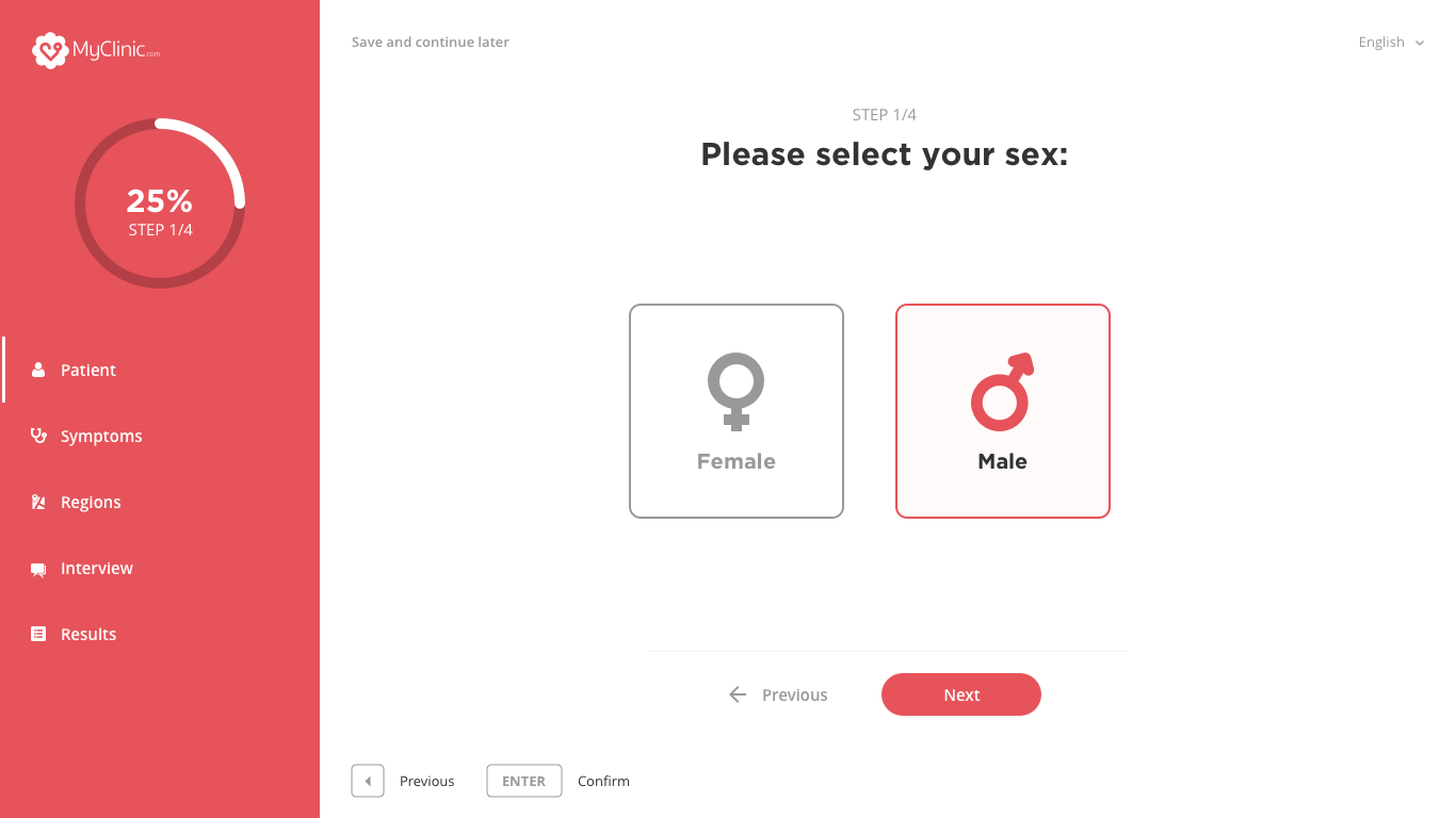
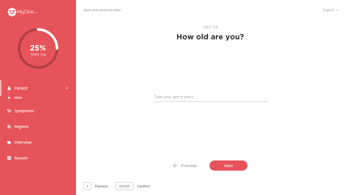
The left panel is interesting because it gives you the number of questions/steps you still have to do. There is a left bar to indicate you the step you are replying. There is nothing more frustrating than the forms where you answer questions and you don’t know how many are left. Besides, you can clearly see all the answers you gave and go back to a previous question by clicking on the step or the statement (e.g: Patient – Male).

By adding interaction, we meant:
- Be able to use the keyboard to validate or go back to a previous question
- Have user-friendly checkboxes with nice UI (e.g: Male / Female)

- Have pre-selected common symptoms to reduce the time spent before having the results
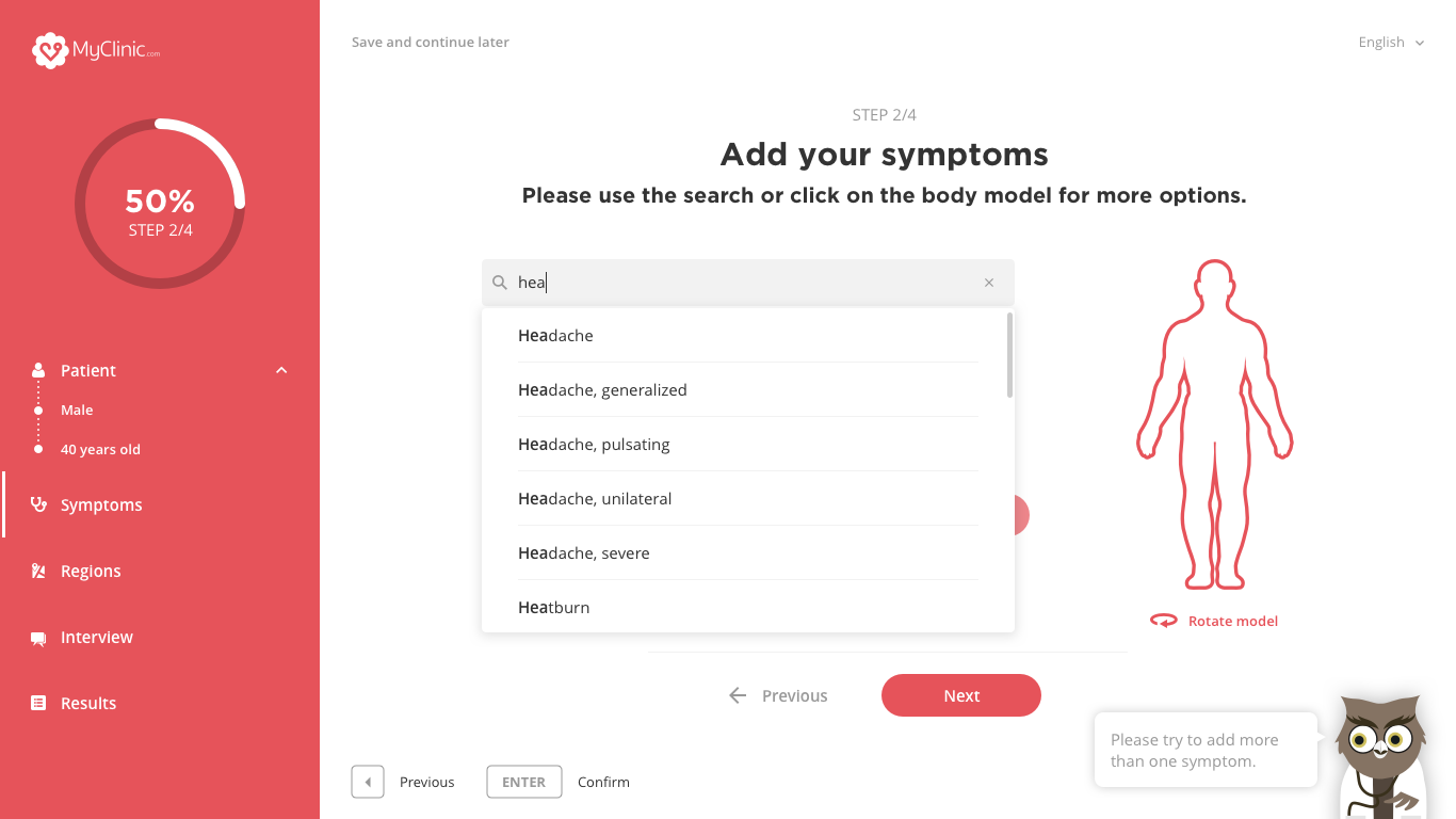
- Add intuitive search bar. After 3 characters, there is a dropdown to help you select the right symptom
- Add animation. On the following screens, you can see a feature to rotate the body and select a part of it to have more specific symptoms
- Have a mascot to communicate with you, make you want to continue and tell you when you have done a good job. This owl doctor can be a little creepy (not like the MailChimp monkey) with his big eyes but keep in mind that it was just for the prototype 🙂

- Have an interactive map to select a region or radio buttons to quickly answer questions
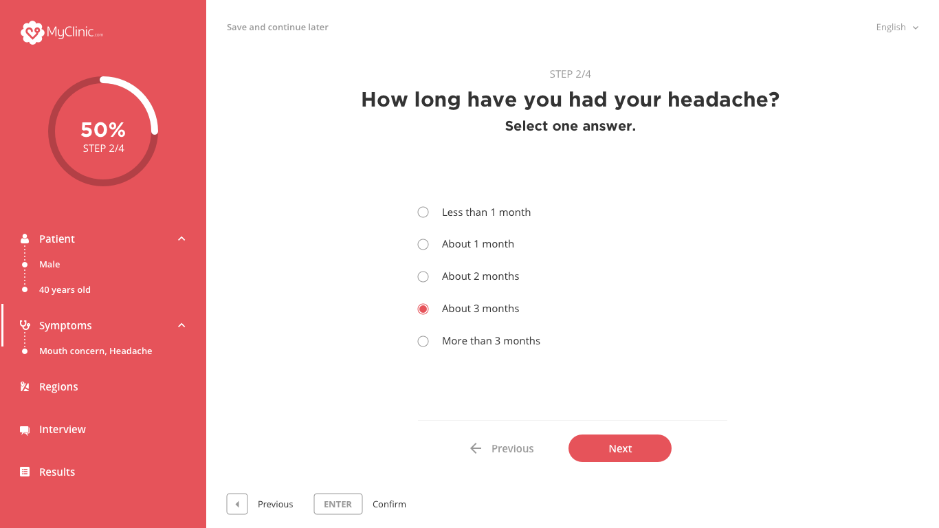

As we can see, given the number of symptoms, we can have a lot of questions. We have therefore always tried to limit them and spend an average of 7 minutes maximum on the form.
We received a lot of positive feedbacks. The prototype has been a success and will probably go live in the next few months.