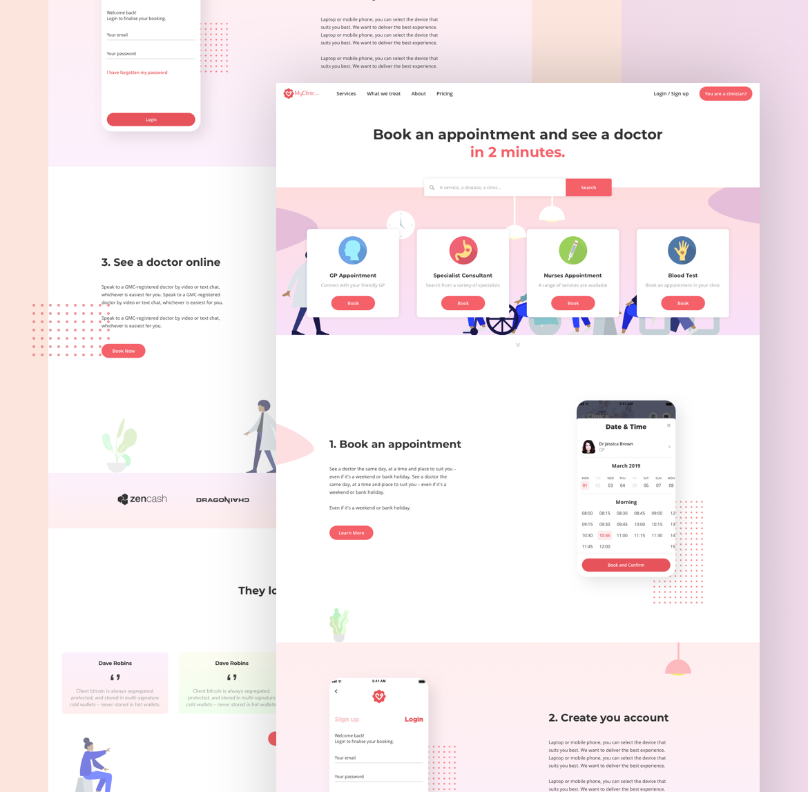
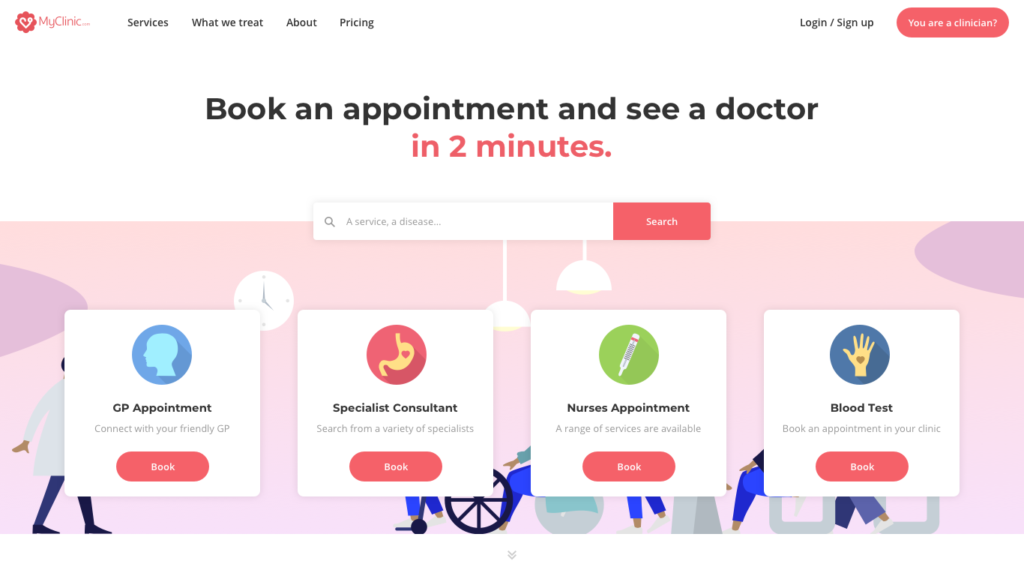
We had 2 types of users: doctors and patients. Even if the Patient Portal was especially for patients, I thought it was more effective to have only one entry for both of them if they wanted to connect to their portal. That’s why the first step was to work on a new version of MyClinic website. We have globally more patients than practitioners as users, so I focused on a homepage for them. The goal was to invite them to search for a disease or book an appointment immediately. Of course, I added a button in the header if you were a doctor. Having only one URL is better for SEO and more coherent for people.
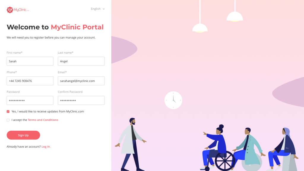
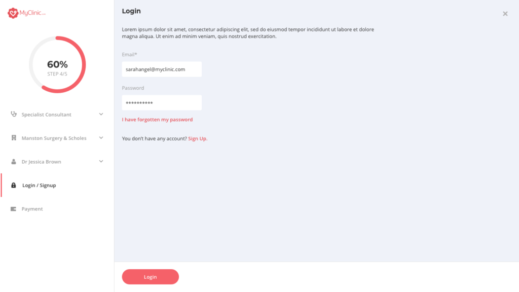
My priority was to let people book appointments even if they were not logged in. There is so much frustration when you want to try a service and you are blocked because you have to sign up. Moreover, users will register more easily if they are already committed to a task and if they like it. Everything is about the experience they have on your platform. If they enjoy it, it will be a simple formality to sign up before to pay for the appointment.
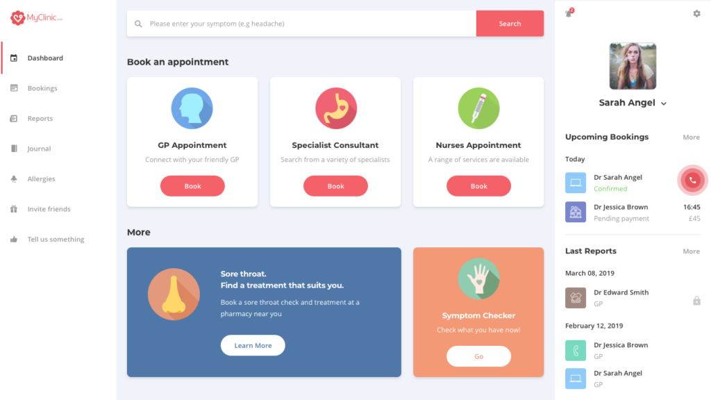
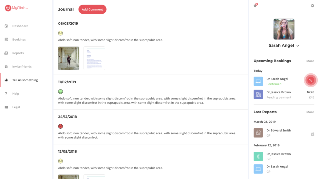
I worked on the dashboard to have a similar view of the mobile application. The right panel keeps the same structure. This is a sum-up of your last reports or future appointments.
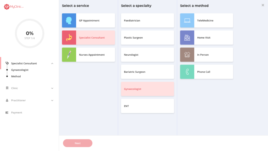
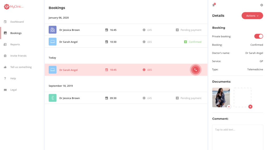
Everything is really accessible and visible. On the left, you have the menu, on the right your bookings/reports and between these panels some important articles or links to other applications (cf Symptom Checker). You can also start your booking process by clicking on a service “GP Appointment, Specialist Consultant or Nurses Appointment”.
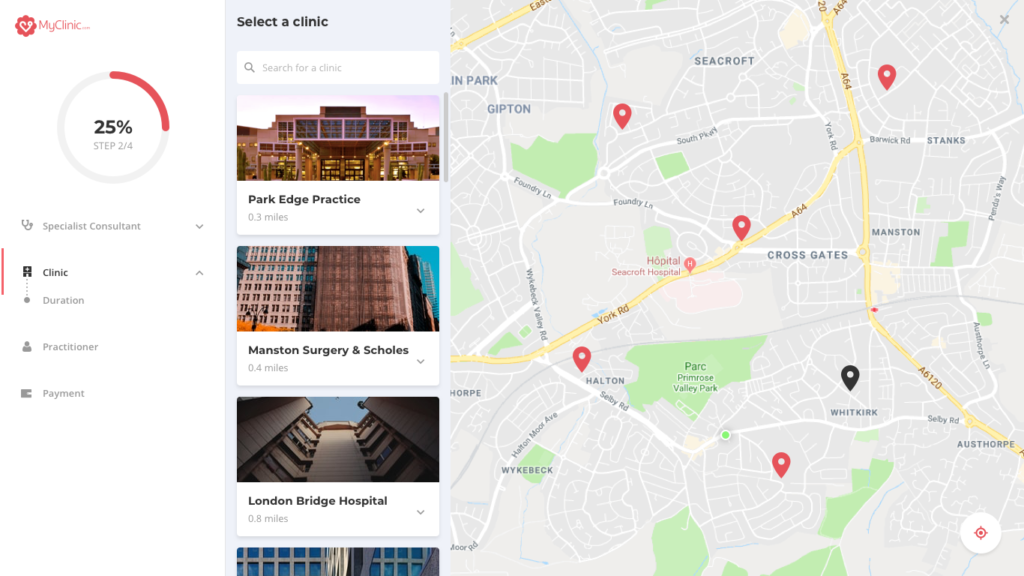
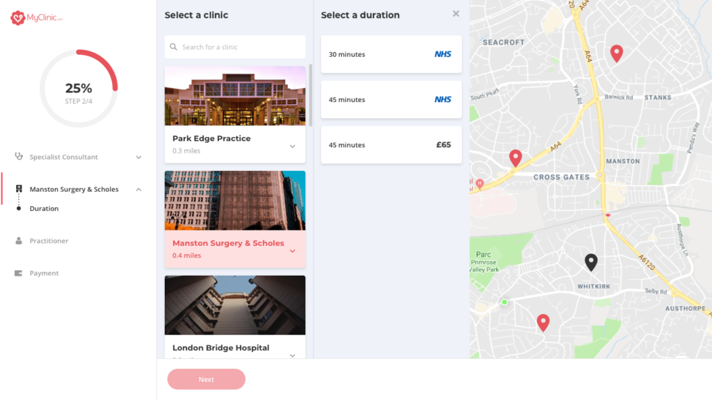
Then, the process is the same than on mobile but because we are on desktop, I have more space to display information and the experience can be slightly different. For example, when a user must select a clinic, he directly has access to a map and he can play with it to select the clinic he wants. We can also have several steps on the same page (clinic, duration, etc.)
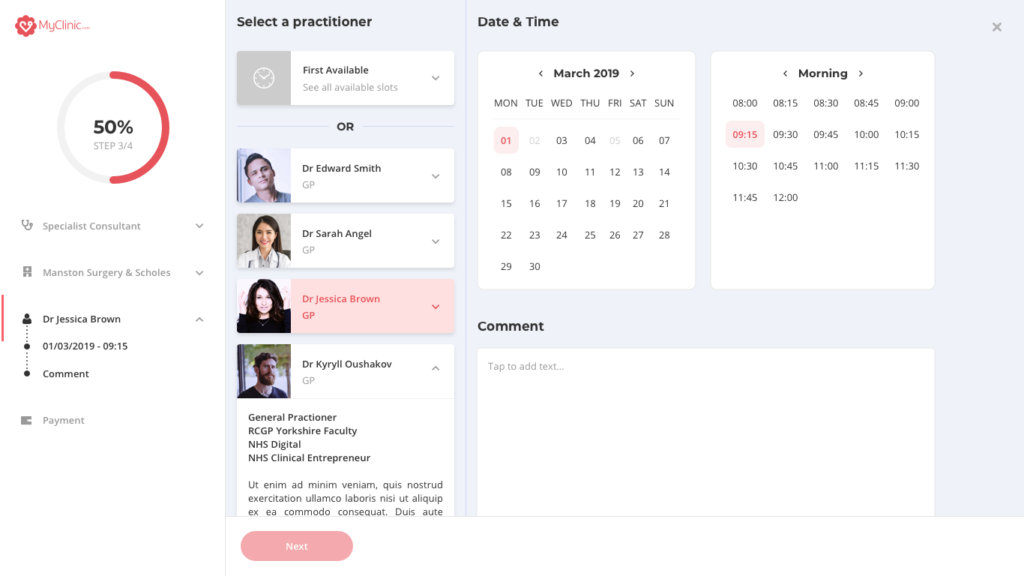
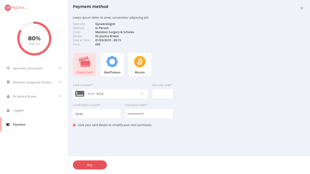
As you can see, on the left side, I re-used the same structure than the Symptom Checker. The component is the same even if the content is not (design system). It gives you the number of questions/steps you still have to do. There is a left bar to indicate you the step you are replying. There is nothing more frustrating than the forms where you answer questions and you don’t know how many are left. Besides, you can clearly see all the answers you gave and go back to a previous step by clicking on the statement (e.g: Doctor Jessica Brown).
Because our application is based on the blockchain and we use a branch of Ethereum to store and secure our patient data, it is possible for people to pay in Bitcoin, Medtokens (our crypto) or fiat currency.
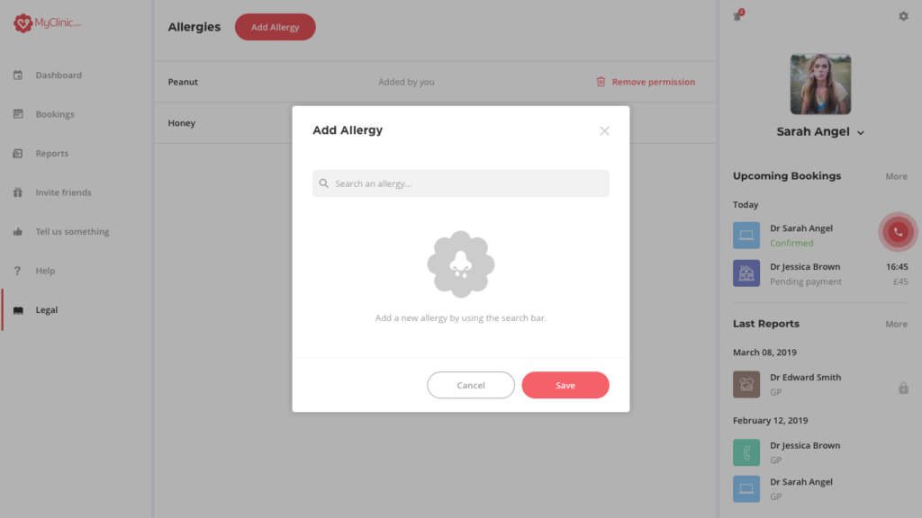
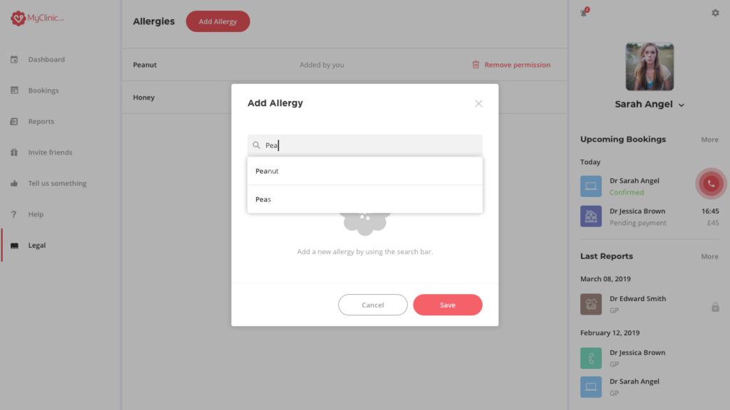
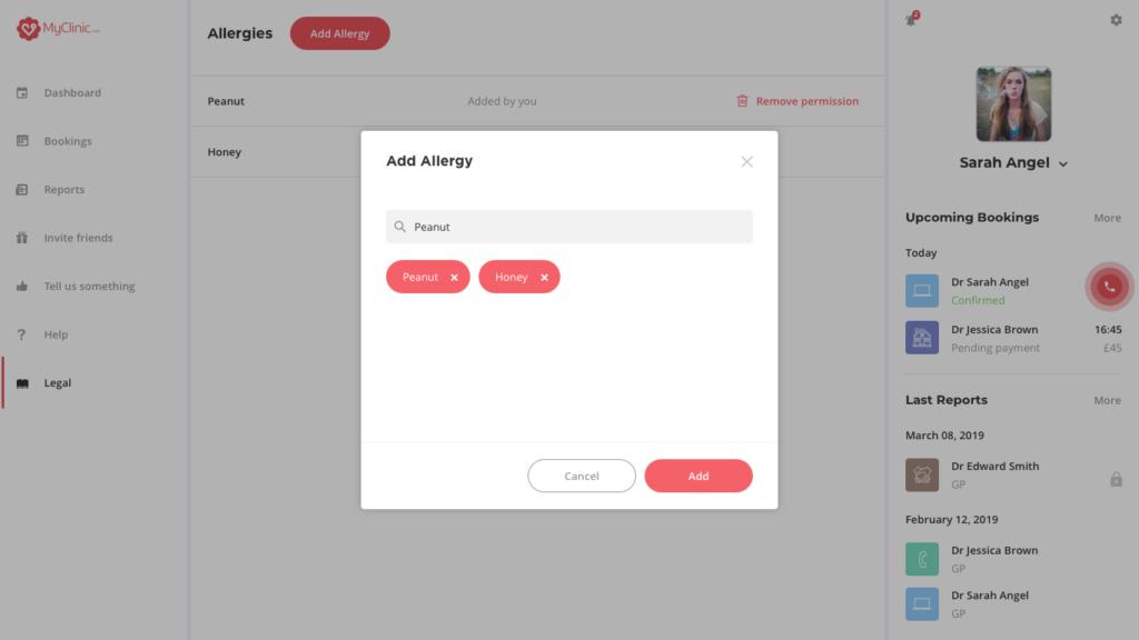
Another example of a pattern we have in our design system is the search bar and the possibility to add symptoms or allergies. Therefore, we use the same component on all our applications. It can be a pop-up or implemented directly in the page but the structure stays the same.
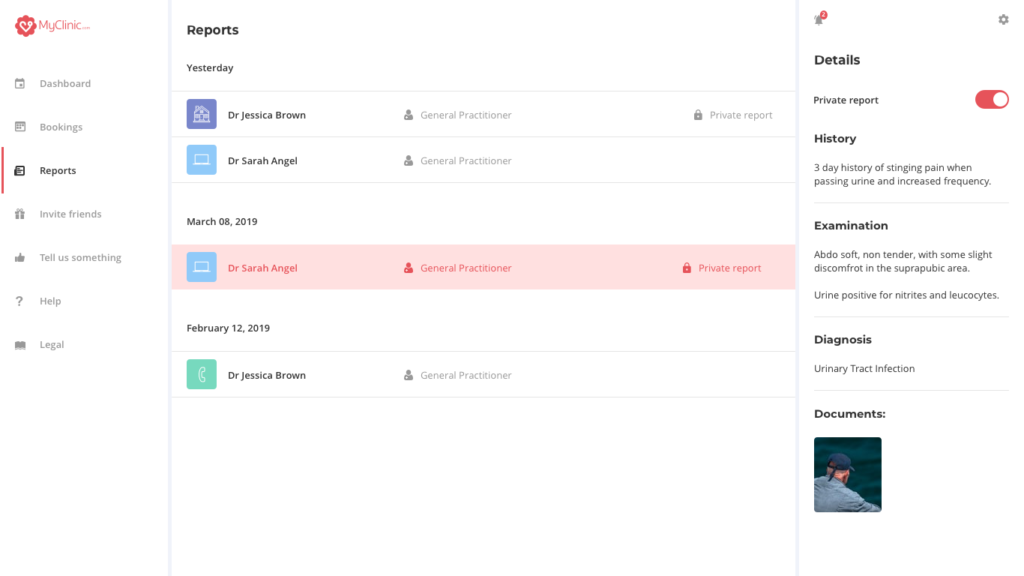
Finally, I find a way to display all the important medical information of our patients while having a clean and refined interface. We organised user tests in order to validate the fact that we had a coherent experience through all the devices.
Besides, our users were really happy to be able to book appointments on desktop. Especially old people can have more difficulties with mobile phones. Understand your users to address them the best experience possible is obligatory.


