The purpose was to create a new trading platform to exchange Crypto, Forex and Metals. Because we started from scratch, my first mission was to analyse the market, competitors and trends. We didn’t want to be like the other platforms. That’s why I referenced all the colours, font-faces, UI that we had on popular trading platforms (Kraken, Binance, Huobi, Deribit…).
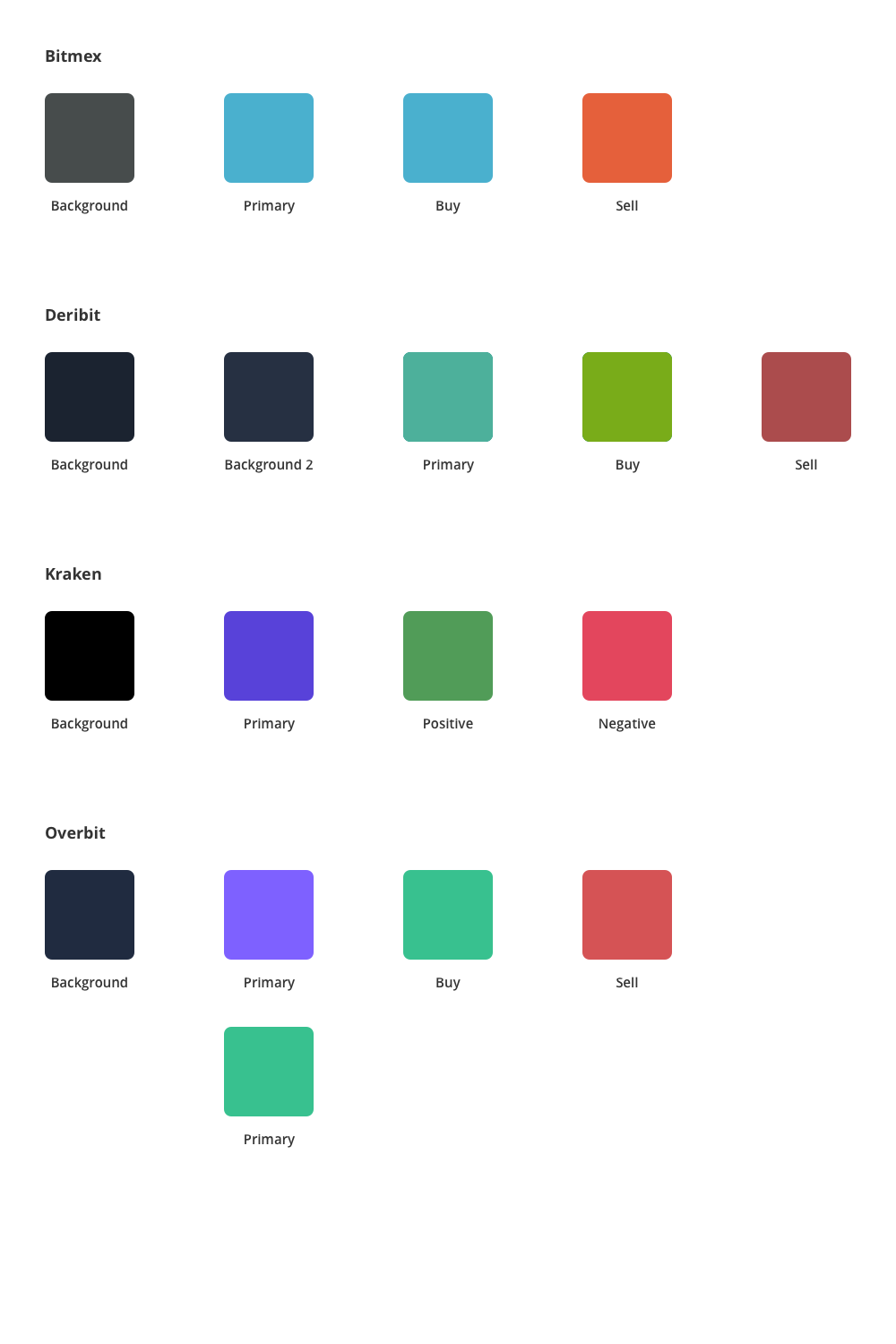
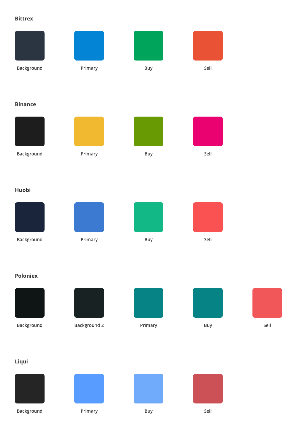
We noticed that 70% of the platforms used blue as the primary colour. And then they used green/blue and pink/red for the Buy/Sell buttons. Binance decided to have a unique colour by using yellow. Same thing for Kraken, which changed its entire brand identity a few months ago. Now their primary colour is purple (very trendy in 2019).
We wanted to use green or purple but, as we already had to use the green colour for the Buy buttons, we decided to choose a purple but less flashy than Kraken. Moreover, we realised that Kraken used this colour for their website but in any case for their platform (black and white).
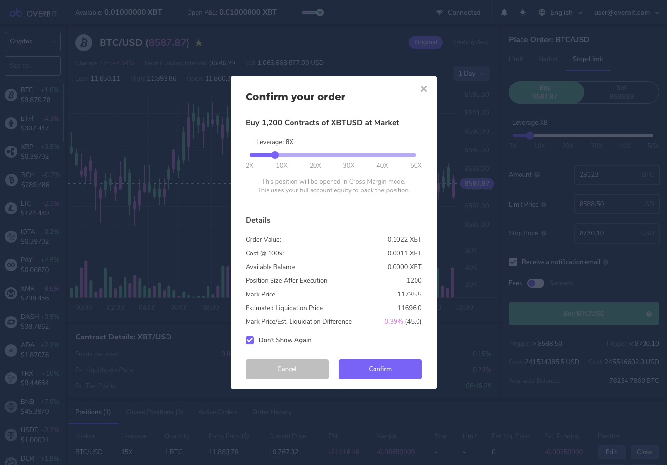
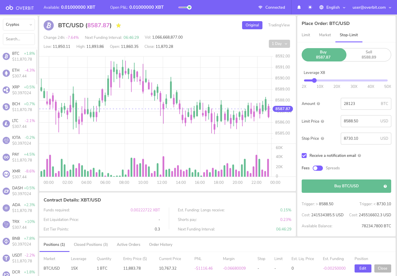
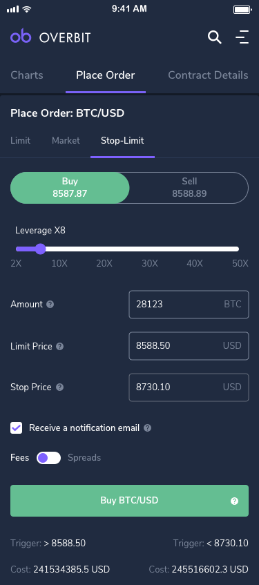
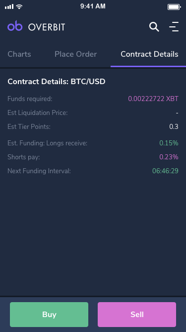
After that, we defined a list of features. It’s important to note that we didn’t want to innovate at this stage of the project. We wanted to replicate the best features we could find on the other platforms but with a nicer UI and UX. Contract details, Market trades, Order book, Place order… We listed everything and we started to design it. It was like a puzzle, we had blocks and the goal was to find the best position for each element.
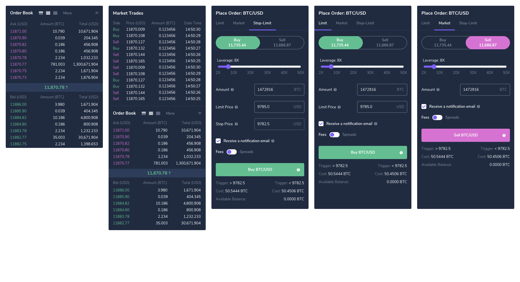
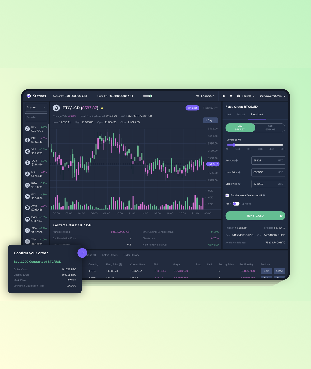
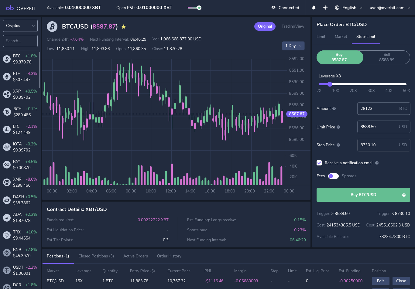
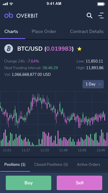
There is a left panel to find a specific currency or have a quick view of the share prices. It is also possible to manage the list of cryptos by using the “favourite” feature. It places them at the top of the list. Unlike some platforms, we wanted to have all the main details on the same view. We didn’t want, for example, to scroll down to trade. After a lot of research, meetings and user interviews with professional traders, we delivered our live trader:
As you can see, we didn’t keep all the features in V1. Due to a lack of resources and short deadlines, we removed the Market trade or the Order book. But it will definitely appear in the future releases.
Some people don’t like the dark version and prefer a light version. It was not a problem for us because the rest of the application is on a white background. So it matches pretty well with the other pages.
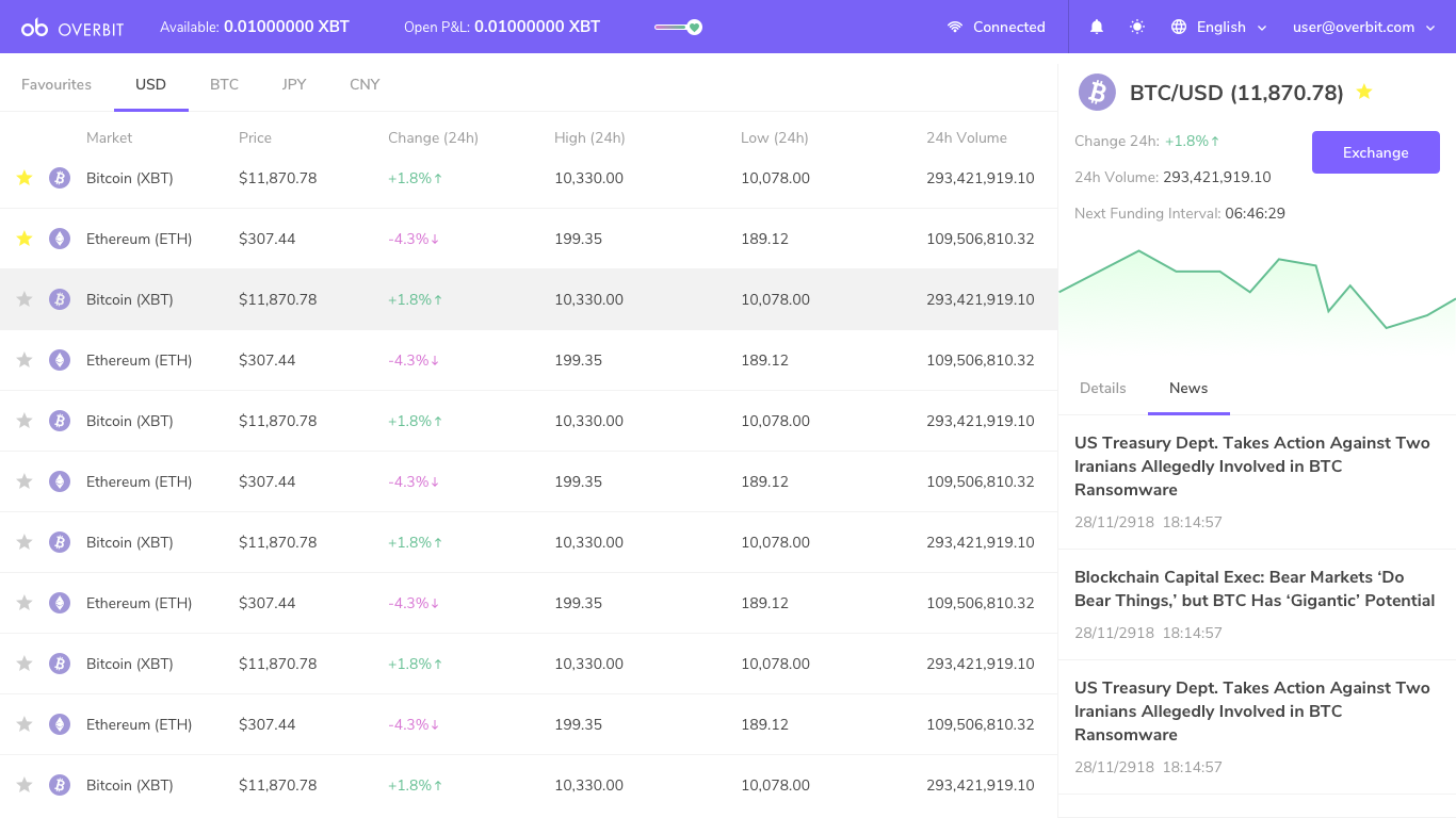
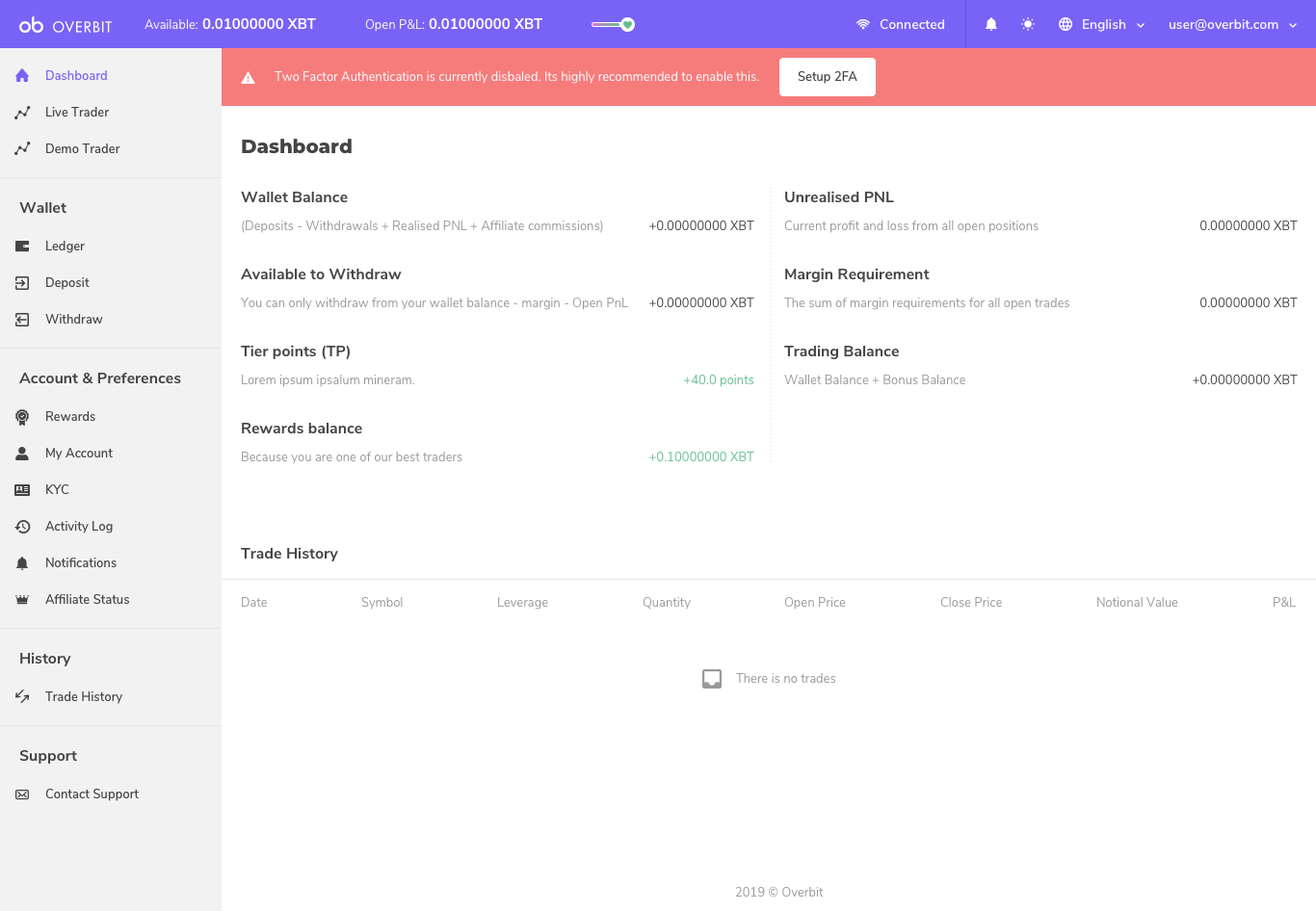
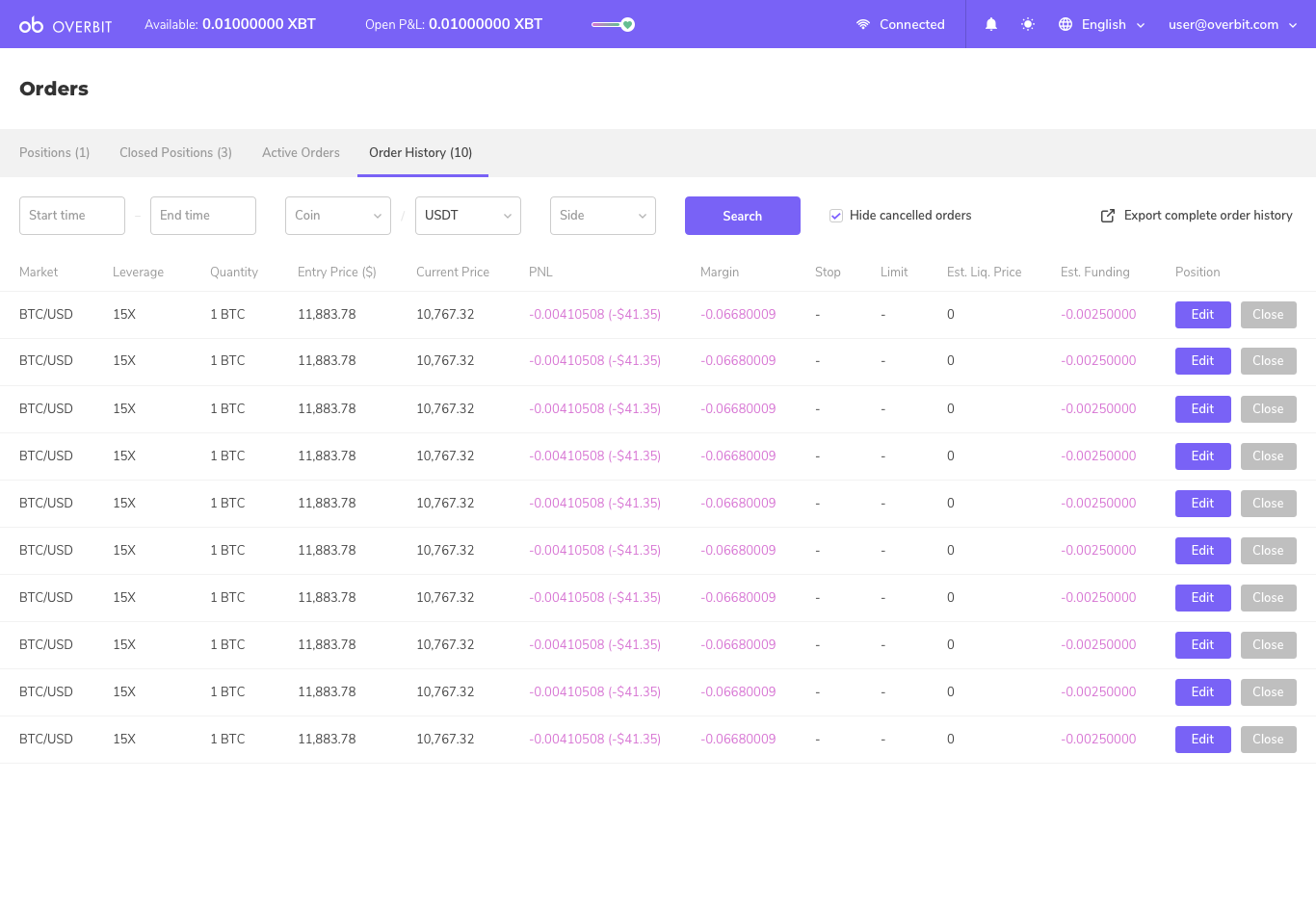
And we worked on the related pages like the dashboard, the market details, the orders, etc.

The mobile version was decided after the first release of the desktop platform. But it has not been a problem for me because, as I said above, we had blocks and the goal was to combine them. So I did the same thing for the mobile version even though, of course, in some cases I had to remove features or think a new way to display them.
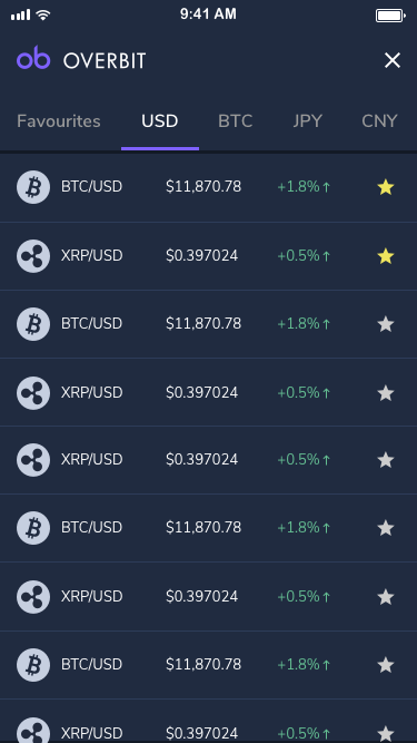
PS: Cryptocurrency logos are greyed out on screens. We can’t do that in reality so now they are colourful.
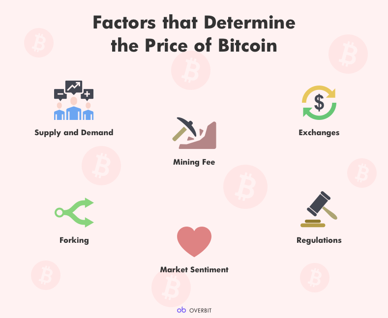
After that, I worked on marketing campaigns to explain cryptocurrencies like Bitcoin, how to trade, what is the difference between Bitcoin and Blockchain, etc. There is a real interest in educating people about cryptocurrencies and Blockchain because they heard of it on TV or Internet but it is still complicated and opaque. They don’t know the apps or platforms they can trust, or how to quickly secure the cryptos they have purchased. There is a real UX job to do to simplify this world.