When we started this project, we wanted to create an application to centralise user health data. It was typically a digital health passport. There were similar applications on the Appstore but none of them allowed people to connect all the devices and see the statistics in one app. And it was only about sport metrics.
Be able to connect our watch, weight balance, etc. was an interesting idea. All your data is generally accessible via the APIs provided by Apple watch, Fitbit….
Moreover, centralising everything in one-app was a trend, even for other businesses (Netflix, Emma).
The first step has been to run surveys and user interviews in order to understand what were the most useful features. We talked to a lot of people, including sportsmen’s, doctors and patients. We started to create wireframes to have a clear idea about the app.
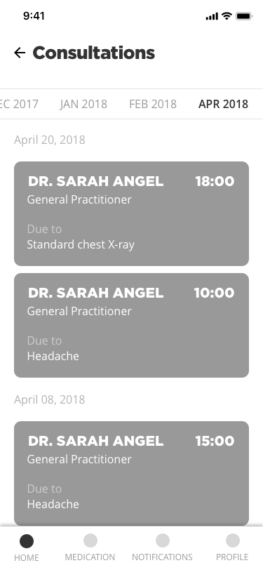
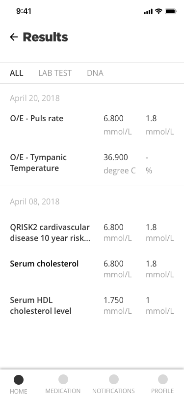
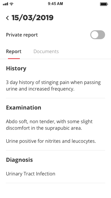
In the meantime, we had discussions with Mayo Clinics and we concluded a partnership with them. They wanted an application with a more “medical” approach than “sport” but less technical than what we had. So we decided to refocus our work and generate new ideas about healthcare. We kept the structure we had but the content had to change and be more user friendly and medical centred. Instead of plugging your sports devices (I am sure this is a great idea), the purpose was to find your medications, prescriptions, appointments, etc. in MyClinic. We also thought about gamification like what we have with Fitbit (rewards, badges…).
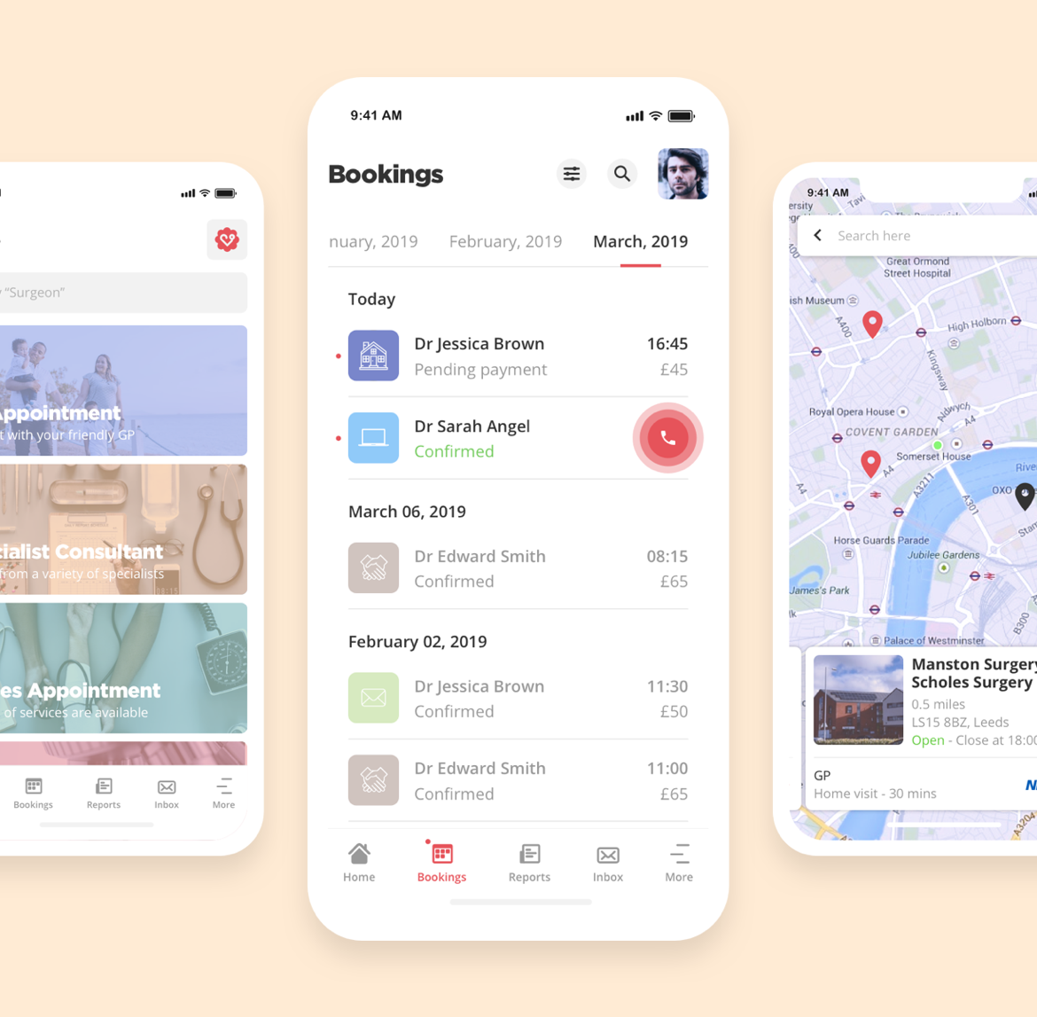
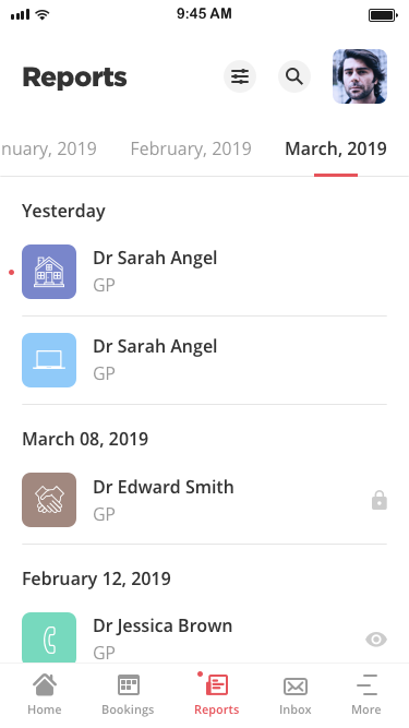
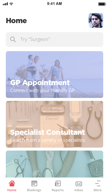
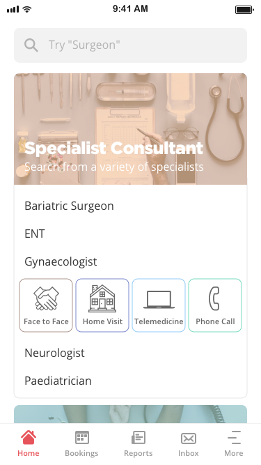
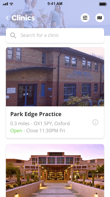
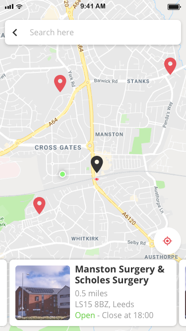
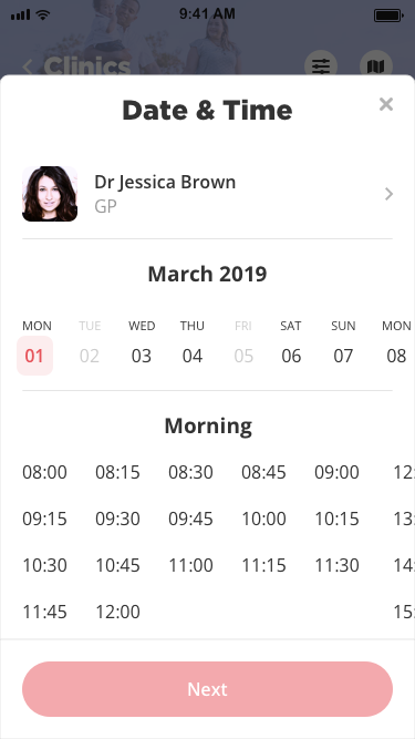
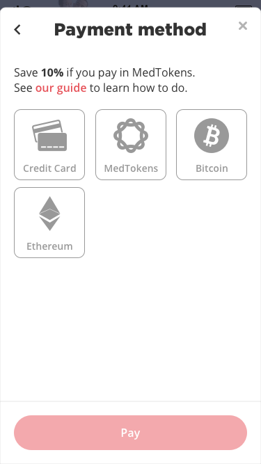
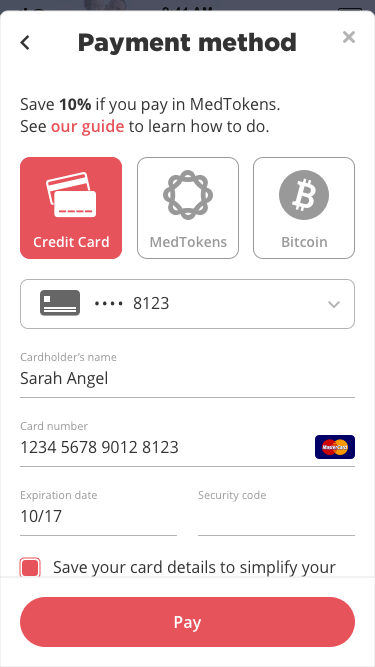
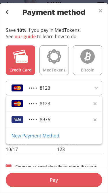
Then we understood that having our medical data was nice but too passive. We could add value by booking appointments and having video consultations. So we developed the booking process:
To be sure we had the right flow, we run user tests in a clinic. We created a prototype with our screens and Sketch and we used it on our mobiles. The exercise was simple, our testers had to book a specific appointment and finish the payment process. We were behind them, silently, to take notes and notice the pain points.
We also organised a workshop “Up On The Wall” where we pined on a wall all the screens of MyClinic. People had post-its and they could add comments, questions, ideas or bugs on each screen. Thanks to them, we improved our product and we added new features.
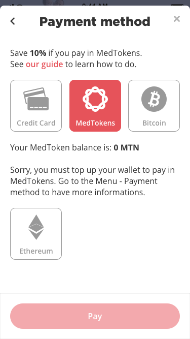
Our application is based on the blockchain. We use a branch of Ethereum to store and secure our patient data. Therefore, we have our own cryptocurrency called Medtokens and we allow people to pay with it. They can also pay in Bitcoin. I definitely think this is a good option but, until now, only a few numbers of users paid with it. It is probably, for most people, too soon to trust and to pay with cryptocurrencies. Hopefully, it will change in the next years.
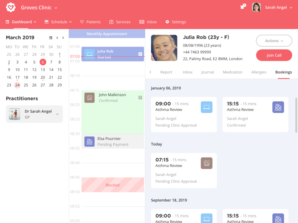
Finally, we needed an interface for practitioners and clinics too. We analysed TPP and EMIS (main software used by doctors) to understand how we could have a more user-friendly approach in terms of UX and UI. These tools are used for decades. They have a ton of features but are really classic and can be difficult to use.
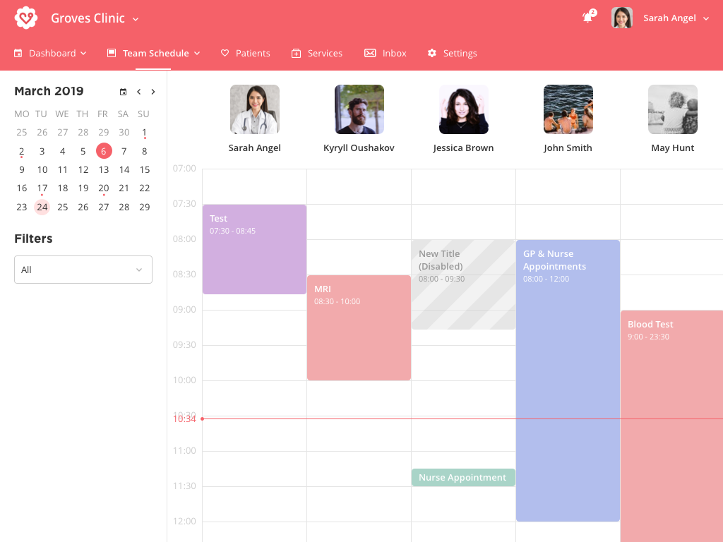
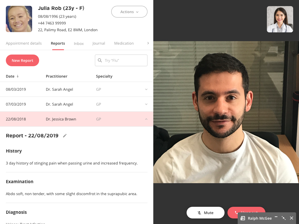
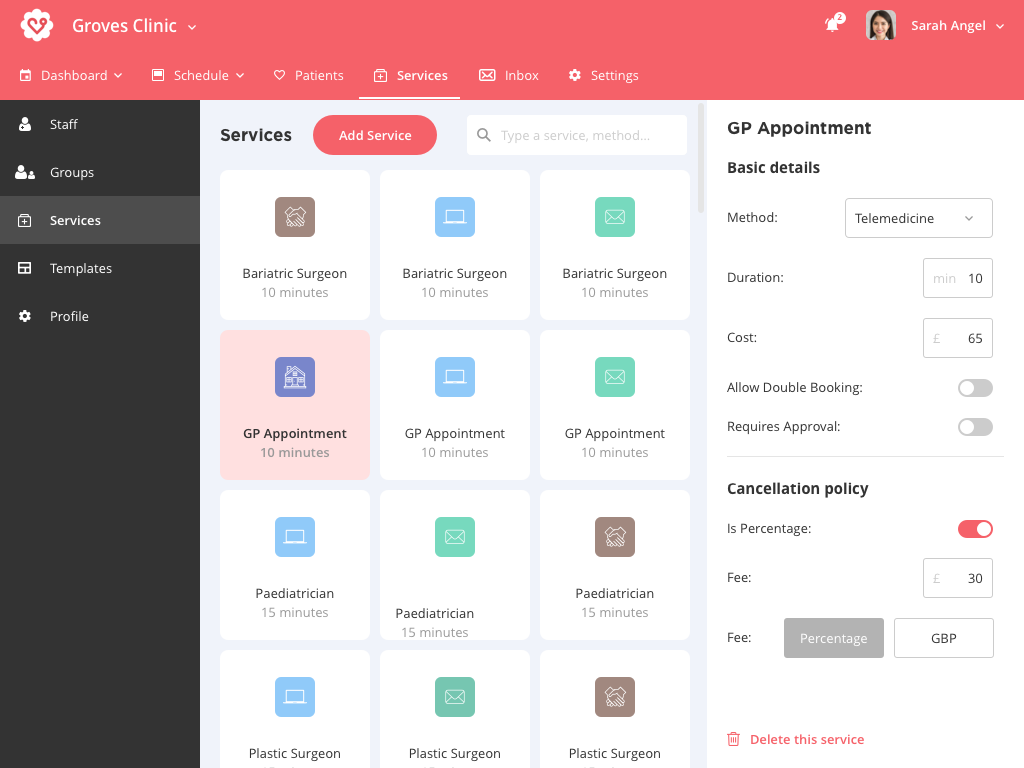
In order to manage their appointments, have video consultations, write reports and medications, we built, in collaboration with doctors, a web app on desktop. There are several levels of permissions. For example, an administrator (clinic) will be able to manage the services available and block time for practitioners for a specific type of appointment.
MyClinic has received the approval of NHS in 2020 and is now available in all the NHS clinics around the UK. We also won the Financial Times Intelligent Business Award which is a great honour.


